The keys of book cover design change from year to year. What worked really well for a hardcover on a bookstore shelf in 1970 is vastly different than what works best on an Amazon browse screen in 2024. Let’s look at the latest updates.
First, as of 2024, 75% of American households have Amazon prime. It’s not even just that the buyers use Amazon. They use Amazon so much they pay up front for free shipping. As an author, you have a personalized book library available 24/7 in 75% of American households. You MUST optimize your cover for Amazon sales. The vast reach of Amazon, compared with one tiny local bookstore, is just mind-boggling.
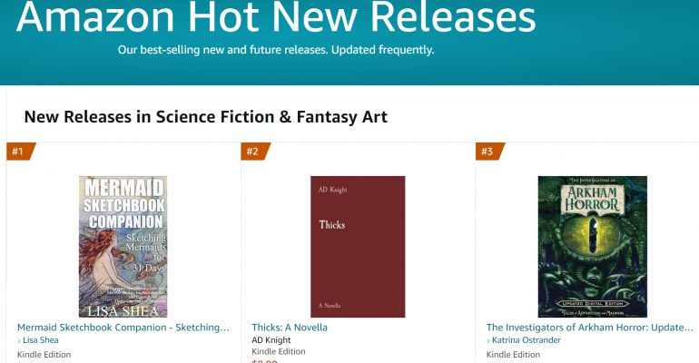
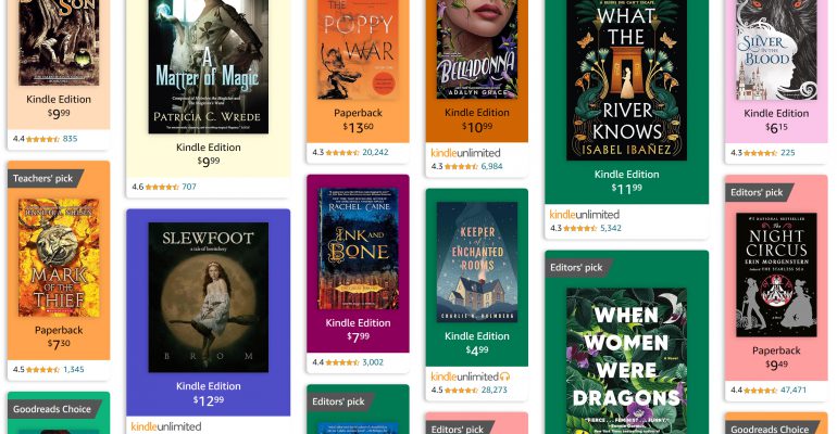
When you browse in Amazon for books in a genre, let’s say historical fantasy, Amazon now focuses on just showing you a GRID OF COVERS. That’s it. You get to see the star rating and NOTHING ELSE but the cover. Amazon doesn’t tell you the title, author name, details, or anything. If those items are not CLEARLY visible on the cover, you’re out of luck. The person is just going to keep scrolling.
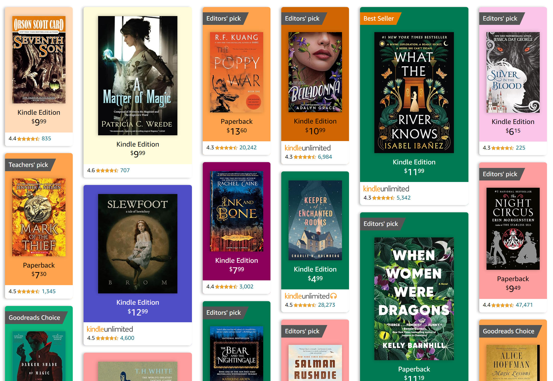
You want to use a title and author font which clearly stand out against the background. The “When Women Were Dragons” is great in that sense. So is “What the River Knows”. But the lower left one? “Darker Shade of Magic”? Good luck reading that one!
You must make sure that the title and author name are clear against that background. Often that involves adding shadow behind the letters so that it’s not “cluttered” in that area. Light-colored letters need to go against a dark background and dark-colored letters need to have a light background. There needs to be contrast in value.
Next, look at the layout of the professionally-published books. There is nearly always a subtitle, a short blurb, or both. Yes THEY CANNOT BE READ AT THIS SIZE :). I understand that. They aren’t meant to be. They are a design feature that in essence says “This book is valuable enough that people buy it in large hardcover format where these tiny letters are legible.” It’s a mark of quality. It’s a good idea to have something like that on your book, for that reason.
Next up, the design theme of your book MUST match this target audience. If someone was scrolling through the historical fantasy books above and then they came across a book presented in this cover style:
That person would keep on scrolling. Sure, my goal book cover is great in the goal book category. But it’s wholly inappropriate as a cover design in with these historical fantasy books. You need your cover to feel like a perfect match for someone who is scrolling in this area looking for this kind of book to read.
If you have a horror story, don’t make it look like an Amish sweet romance. If you have a gritty NYC thriller with gore, it shouldn’t look like a gentle space adventure on Mars. Make sure the cover clearly broadcasts the type of book you have. That way you draw in your target readers with 5-star reviews and gently hold off reader who hate your type of genre and who will give you 1-star reviews.
Most professionally published authors change out their covers every few years, to make sure they keep reaching their target audience as perfectly as possible. That’s how they keep selling books to the new audience. For those of us who self publish, it’s even easier, because we can do it whenever we want, for free.
Make sure you browse through Amazon through your target category area. Look at the covers. Make sure, at a TINY SIZE, your own cover has a similar look and feel to the ones you want to sell alongside.
Ask with any questions, and good luck!