The keys of book cover design change from year to year. What worked really well for a hardcover on a bookstore shelf in 1970 is vastly different than what works best on an Amazon browse screen in 2024. Let’s look at the latest updates.
First, as of 2024, 75% of American households have Amazon prime. It’s not even just that the buyers use Amazon. They use Amazon so much they pay up front for free shipping. As an author, you have a personalized book library available 24/7 in 75% of American households. You MUST optimize your cover for Amazon sales. The vast reach of Amazon, compared with one tiny local bookstore, is just mind-boggling.
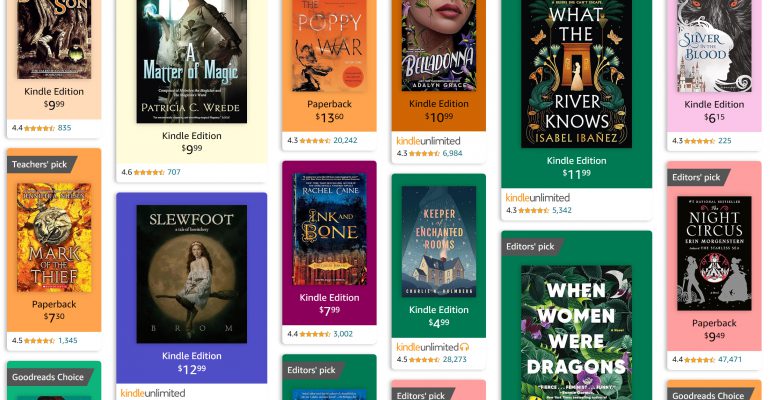
When you browse in Amazon for books in a genre, let’s say historical fantasy, Amazon now focuses on just showing you a GRID OF COVERS. That’s it. You get to see the star rating and NOTHING ELSE but the cover. Amazon doesn’t tell you the title, author name, details, or anything. If those items are not CLEARLY visible on the cover, you’re out of luck. The person is just going to keep scrolling.
You want to use a title and author font which clearly stand out against the background. The “When Women Were Dragons” is great in that sense. So is “What the River Knows”. But the lower left one? “Darker Shade of Magic”? Good luck reading that one!
You must make sure that the title and author name are clear against that background. Often that involves adding shadow behind the letters so that it’s not “cluttered” in that area. Light-colored letters need to go against a dark background and dark-colored letters need to have a light background. There needs to be contrast in value.
Next, look at the layout of the professionally-published books. There is nearly always a subtitle, a short blurb, or both. Yes THEY CANNOT BE READ AT THIS SIZE :). I understand that. They aren’t meant to be. They are a design feature that in essence says “This book is valuable enough that people buy it in large hardcover format where these tiny letters are legible.” It’s a mark of quality. It’s a good idea to have something like that on your book, for that reason.
Next up, the design theme of your book MUST match this target audience. If someone was scrolling through the historical fantasy books above and then they came across a book presented in this cover style:
That person would keep on scrolling. Sure, my goal book cover is great in the goal book category. But it’s wholly inappropriate as a cover design in with these historical fantasy books. You need your cover to feel like a perfect match for someone who is scrolling in this area looking for this kind of book to read.
If you have a horror story, don’t make it look like an Amish sweet romance. If you have a gritty NYC thriller with gore, it shouldn’t look like a gentle space adventure on Mars. Make sure the cover clearly broadcasts the type of book you have. That way you draw in your target readers with 5-star reviews and gently hold off reader who hate your type of genre and who will give you 1-star reviews.
Most professionally published authors change out their covers every few years, to make sure they keep reaching their target audience as perfectly as possible. That’s how they keep selling books to the new audience. For those of us who self publish, it’s even easier, because we can do it whenever we want, for free.
Make sure you browse through Amazon through your target category area. Look at the covers. Make sure, at a TINY SIZE, your own cover has a similar look and feel to the ones you want to sell alongside.
I’m reading the works of H. P. Lovecraft in order of publication, which of course is open to interpretation. In my case, it means I am reading Beyond the Wall of Sleep as story number 3, after The Alchemist and A Reminiscence of Dr. Samuel Johnson. It’s fair to say that Beyond the Wall of Sleep is an enormous departure from these first two works.
In Beyond the Wall of Sleep, we find Lovecraft, who is now around age 29, delving into the area which would become his world. Lovecraft is no longer writing about creepy wizards in gothic halls or fantasizing of meeting famous writers. Here, Lovecraft is fascinated with the world of dreams compared with reality. What is a dream? What is reality? Is this reality we experience the “main plane”? Are there others out there different from us, others we could never possibly fully understand?
It’s also fair to say that Lovecraft’s soul-deep sense of superiority shines through on this piece. His main character is educated, intelligent, and worthy of appreciation. Compare that with the backwoods barely-human cretins of the mountain country which Lovecraft denigrates with every single nasty word he can come up with, including “white trash” (in 1919!) and “bovine”. Apparently nobody in such a realm could possibly have the tiniest hint of intelligence. Or common sense. They are barely above the level of a farm animal.
It’s interesting of course that Lovecraft goes into such detail about how awful these woods-folk are and then says they are indescribable. Somehow he managed to describe them.
And how does Lovecraft know that these people have NO stories or fables they share? Surely that is a quite typical way to pass the time without radio or books! If anything you would think these families would have MORE time to tell stories to each other.
In any case, Lovecraft realizes that a super-intelligent superior being hangs out in this dolt’s body and takes over at night. Sometimes when the dolt awakens, there’s still that glimmer of the super-being there because the vocabulary used changes (“improves”?). But doesn’t this mean that the super-being is the one who callously murdered a neighbor, for what reason? For trying to calm the dolt down? It’s not as if the super-being was going to “do” anything in the dolt’s body. The super-being has far more important things to care about, involving a far-off star.
Speaking of which, that star is a real one. And the “new star” created by the super-being is also real. However, light moves at a certain speed. It’s not as if the super-being could create the new star and instantly we would see it. We would have to wait a LONG time before the light of that new star reached us. Did the super-being jump back in time just to give a ‘hello there’ message to his Earth-bound friend?
All in all, this probably perfectly encapsulates much of how I feel about Lovecraft. I like the descriptive unsettled horror of the unknown. I’m unhappy with how this MUST involved ‘stupid’ dull throwaway people who are not deserving of respect because of their group.
Many people know of HP Lovecraft because of his creepy science fiction / fantasy stories. But every author can take a turn into another genre for fun. In H. P. Lovecraft’s case, one of the earliest works he wrote was in essence making fun of himself and the reputation he’d built as a ‘person who wrote in an old-fashioned way’. That story was “A Reminiscence of Dr. Samuel Johnson“.
H. P. Lovecraft, born in 1890, loved the Old Times. He was racist, misogynist, and wished he lived in an earlier time when White men could simply rule the world without all this trouble. He enjoyed the writings of those racist older folks. So, in this story, he writes in essence about himself as a fantasy creature, claiming that he’d been born on August 20th 1690 – i.e. his actual own birthday, just two hundred years earlier. Lovecraft even says in his story that he’s tricked current people into thinking he was ONLY born in 1890.
In this fantasy world of Lovecraft’s, he got to hang out with all of his favorite old-time authors like Alexander Pope and Samuel Johnson. Lovecraft has fun describing his author friends, and how they would look, and how he would interact with them. Lovecraft jokes that he and Johnson would have a battle of wits, that Johnson would love how snarky Lovecraft was, and they’d become fast friends.
To us readers, over a hundred years later, a lot of this can feel like simply a list of names of ancient authors. Lovecraft mentions in passing a Thomas Percy who collected the “Reliques of Ancient English Poetry in 1765”, which was an amazing effort which helped publicize a wide range of ballads. Yes, this is stunning in terms of 1700s culture, but do most Cthulhu-loving readers care at all about this?
And, as it turns out, Samuel Johnson teased that ballads were often fairly brainless in their construction a la:
“The tender infant meek and mild Fell down upon a stone; The nurse took up the squealing child But yet the child squeal’d on.”
Percy was not amused.
So, similarly, Lovecraft has in his own story that Samuel Johnson recited a poem and that Lovecraft then made changes to it.
This piece isn’t really meant to be a “story” as much as a fantasy “What if I could have met these cool people” episode, as well as a “I’m not appreciated by my own peers because I was meant to live in another time.” I suppose it’d be like me writing about hanging out with Tolkien and his friends in a tavern, talking about hobbits and lions and so on, and having them comment on my stories. It’s a fun escapist fantasy.
So while this isn’t about cosmic horror, it does give a lot of insight into the mind of Lovecraft, how he felt unappreciated and misunderstood in his own time, and how he dreamed of living in a different time.
Read “A Reminiscence of Dr. Samuel Johnson” for yourself:
I love measuring things. I have devices around the house that measure humidity, temperature, carbon monoxide levels, VOCs, and particulates. With the global rise in pollution and pollen numbers, I’m particularly interested in tracking the particulate counts. I own the Amazon air monitor and was looking at the Dylos DC1100-Pro air quality monitor. I was intrigued – the Dylos doesn’t measure in industry-standard values of ug/m3. Instead it only measures in raw COUNTS of units, in an items-per-cubed-FOOT measurement. So how does that compare with the traditional ug/m3 value?
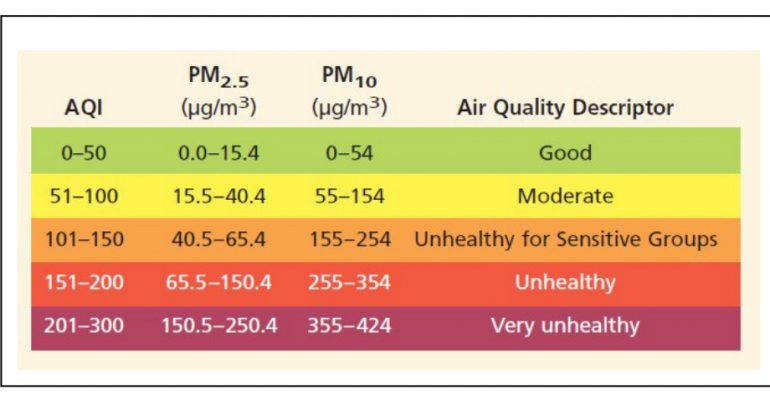
First, let’s talk about the industry standard for measuring pollution and pollen. That standard is ug/m3. Technically those letters actually look like this: μg/m3. You can see that in the chart below. Don’t worry about what the chart actually portrays – we’ll get into that soon enough.
In this essay, I’m generally not using the Greek letter μ or the superscripted 3 (m3) to make it easier for people to search on and find this write-up. People are generally going to search with the letter “u” rather than try to figure out how to make the Greek “micro” symbol μ.
What Is ug/m3?
In any case, the measurement part (the ug/m3) is indicating you count the pollen / pollution / etc. by taking a box of air that is a meter on each side – a cubic meter. This is roughly slightly larger than the size of a typical four-burner kitchen stove. Imagine that stove hollowed out and filled with air. That’s the air sample we’re talking about.
So now the pollution part. The ug part is micrograms. Micrograms is a weight value. It’s usually written either as ug or mcg. This is SMALLER than a milligram. A gram is very light – about the weight of one raisin. A milligram would be 1/1,000th of a raisin. A microgram would be 1/1,000,000th of a raisin. Very very small. So we are talking about quite teeny little volumes of pollution. If you look at that above chart from NASA, a combined weight of just 65 micrograms in an entire stove’s worth of air can cause damage to our lungs. That’s why it’s so important to be attentive to pollution and pollen.
What Is PM0.5 PM2.5 and PM10 for Pollution and Pollen?
Now that we know we’re measuring the weight of something in an air box the size of a stove, just what is it exactly that we’re measuring? Yes, we’re trying to measure pollution and pollen, but what do all these PM0.5, PM2.5, and PM10 numbers mean?
The numbers are categorizing the size of the pollution and pollen units. Larger units and smaller units damage us differently. Larger units might not wriggle into the lungs, while smaller units sneak into the lungs and cause damage there.
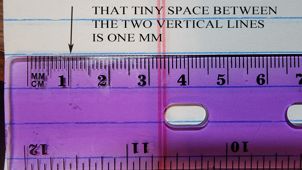
The PM stands for particulate matter. The number is about how many microns wide the item is. A micron is just a shorter name for a micrometer, which is abbreviated as u / μ. A micron is really tiny. If you look at a ruler, you know how it has centimeters (cm) and then tiny millimeters (mm)? You could fit 1,000 microns within one tiny millimeter.
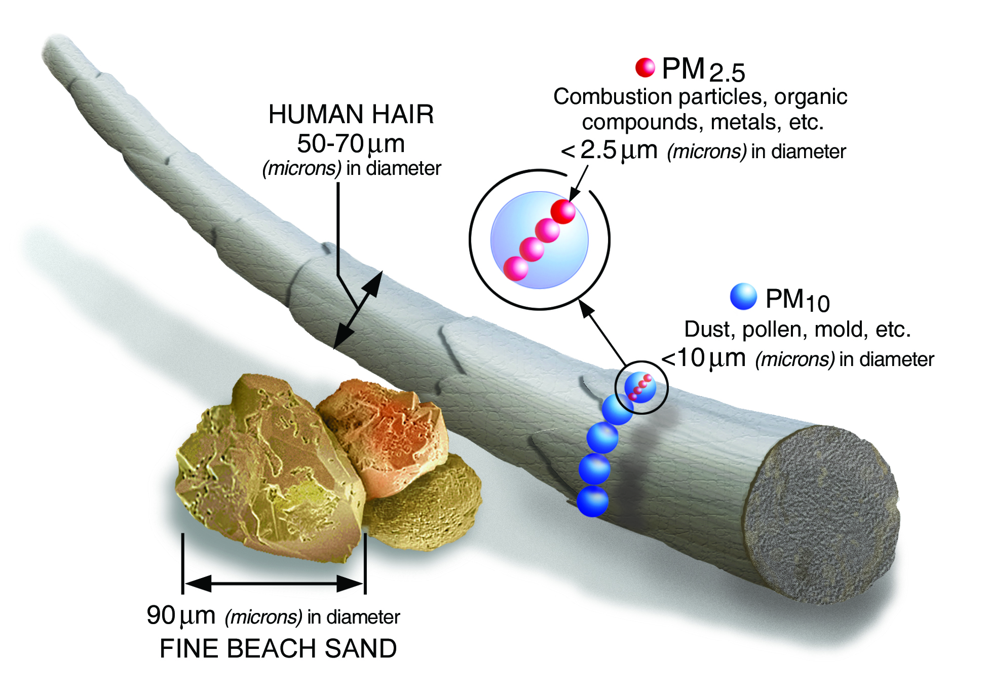
This next diagram is from the EPA. It shows the relative size of items in the width of microns. Remember, you could fit 1,000 microns inside a single mm.
So if you know how thin a piece of human hair is, you can see how tiny something that is only 10 microns wide would be. Something only 2.5 microns wide is even teenier.
In terms of which types of pollution / pollen fall into which categories, here’s a lovely chart by Jisaac9, Mieszko the first:
So it’s good to know how MUCH pollution / pollen is in our air as a general weight per volume of air measurement. It’s also good to be able to break that out by how big or small the pollution / pollen items are, since each size has its own challenges.
So if we look at that EPA chart again, it’s starting to make more sense. It’s showing us the values for both ‘smaller’ (2.5ug) and ‘bigger’ (10ug) bits of pollution. It’s telling us how much weight of each could be found in a stove-sized cube of air before it starts to harm the human body.
The AQI is the Air Quality Index. It’s just a random range used to help the EPA give nice round numbers to reports, so they can tell weather stations “the air quality is 200 today – people should stay inside”. The AQI is not a measurement of anything specific. Similarly, the colors assigned to the ranges are just to help typical home viewers know that the air is healthy (green) or not healthy (red).
The numbers we actually care about measuring are the ug/m3 values for each group of particulates.
So how do you figure out what those values are for your own home or office?
Use a Weather App
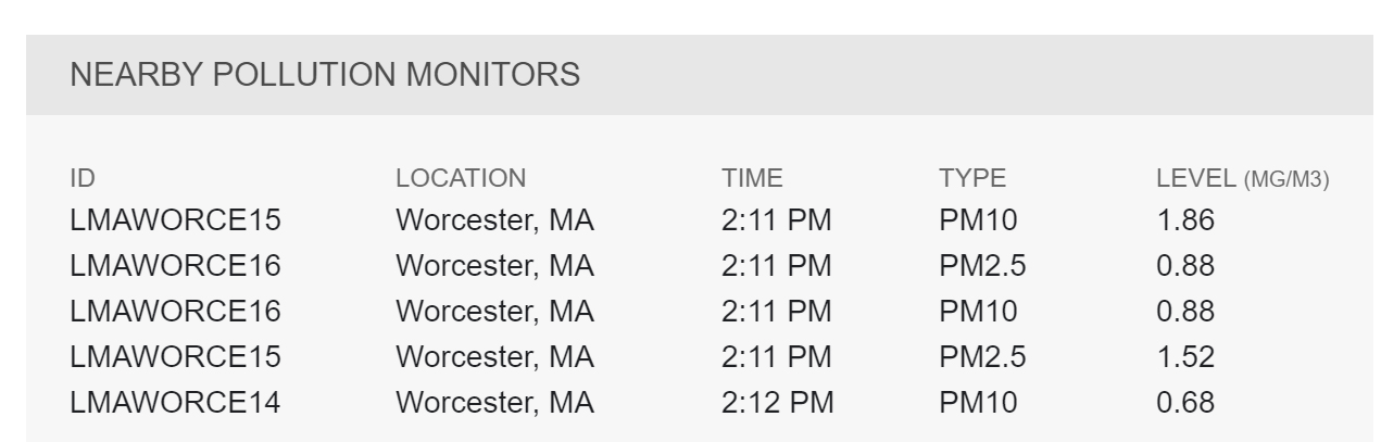
I like to use Weather Underground, but there are many web air quality reporting options out there. Weather Underground will give me a targeted value for both PM2.5 and PM10 on a regular basis. This gives me a starting point for how tree pollen, wildfire smoke, etc. are impacting my area. You’ll see in their reports that for Worcester they have at least three different stations (14, 15, 16) reporting.
But as we all know, pollution in one city can vary wildly between those who live next to a highway vs those who live on a high hill overlooking the ocean. So while a city-wide reading can give you a starting point, it’s also good to get a sense of how your actual personal space is doing. That’s where home monitors come in.
Amazon Home Air Monitor
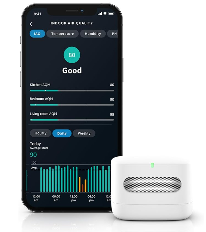
There are many options on the market. For my testing I bought the Amazon air monitor. It ties into Alexa meaning I can check on it from anywhere I’m traveling, which is quite fun. I can tell exactly when Bob is cooking toast. Toast really lights up the system.
The air monitor itself really is that small, compared with a cellphone. I am in the process of doing an entire video series about using this, including doing petri-dish testing in areas, and more. so that is on its way. This article here is a starting point for that project. I’ll let you know when the video reviews are ready. As a super-quick summary, though, for particulates the Amazon unit is tracking the PM2.5 size and and can give updates every 5 minutes. You can move the monitor anywhere in the house as long as you can plug it in. It’s USB-powered so you can plug it into a power bank if you wish.
Dylos Air Quality Monitor
A relative of mine has the Dylos Air Quality Monitor. This is nice because it is able to measure SMALLER than PM2.5, which most home air quality monitors can’t do. The Dylos will show you a value for both PM0.5 and PM2.5. However, unlike most other air quality monitors, the Dylos only shows you a RAW PARTICLE COUNT, as in the actual number of little pollen or pollution items it counted. And the Dylos is counting those as an estimate for a 0.01 cubic foot of air. Yes, 0.01 cubic foot – a measurement value nobody else seems to use.
So how would you even convert that number into the industry standard ug/m3?
OK, let’s say you have a Dylos PM2.5 count of 1102. The system detected 1102 units of pollen (etc.) in a 0.01 cubic foot of air. According to the Dylos instruction manual, when it displays 1102 it would mean 110,200 units in a full cubic foot of air.
Now we need to convert what that would mean for a cubic meter of air. In order to convert from a cubic foot to a cubic meter, we multiply the cubic foot value by 35.3147. That would give us 3,891,680 individual pollen / pollution units in this cubic meter of air.
But what is that in the ug weight which is industry standard?
The average weight of a PM2.5 sized pollen / pollution item is 1.0×10⁻¹² kilograms = 0.000000000001 kg = 1 pg. That’s PICOgram. So if we take 1 picogram per pollen unit, multiply it by 3,891,680 pollen units in a square meter, we get 3,891,680 picograms of weight. That is equivalent to 3,891.68 nanograms of weight (1.0×10⁻⁹). That is equivalent to 3.89168 micrograms of weight (1.0×10⁻⁶). And micrograms per cubic meter is exactly what we were aiming to discover!
Going Forward …
So here’s what I’m still researching.
First, I’m assuming when the EPA has values for 2.5ug and then 10ug pollution groups, it’s not just catching items of that one particular exact size. I’m assuming the 2.5ug group actually means items in the range of 2.5ug to 9ug, and then the 10ug group is for items in the range of 10ug and up. But how far ‘up’ do they go? And do they really filter in a series, to make sure no larger-than-9ug items get into their smaller 2.5ug measuring unit?
The same questions would apply for the air monitors at home.
That information would then impact how we try to determine the “weight” per counted pollen unit, for counting devices like the Dylos. If Dylos reports let’s say 8000 pollen units of size 2.5ug, we imagine that not every single pollen unit is exactly 2.5ug in size. Some might be larger. Some may be 3ug. Some may be 4ug. So it would be useful to get a sense of what the average sized Dylos catch tends to be, in their 2.5ug filter section. Is there a way to tell?
I’ll post updates as I get more information! Let me know if you have any other ideas!
Pollution size chart by Jisaac9, Mieszko the first – This file was derived from: Airborne-particulate-size-chart.jpg:, CC BY-SA 3.0, https://commons.wikimedia.org/w/index.php?curid=86896879
The short story The Alchemist written by H. P. Lovecraft was written in 1908 when Lovecraft was a teenager and published a few years later. This is often thought to be the first, or at least one of the first, short stories that Lovecraft wrote.
My review of The Alchemist contains a LOT of spoilers, so I highly recommend you read the short story first:
First, it’s certainly a nice work for a first short story. The ‘twist ending’ is quite telegraphed, but heck, Lovecraft is a teen. There are good uses of descriptions and setting the scene. I’m a bit iffy on the super-good main character vs the dastardly-evil two villains, but it’s also fair that we only learn about the villains’ traits from the family members of the cursed family. We’re not getting objective views.
That being said, it’s suspect that the only redeeming trait of young son sorcerer Charles is that he adores his father with “a more than filial affection.” Hmmm. That would seem to be fairly questionable to me.
Also, Count Antoine has lived alone in this chateau for his entire life – 32 years. He’s barely had a man-servant to be around. Sure, Antoine spends some time reading – but he also explores the chateau and surrounding wood. How in the world is there possibly entire SECTIONS of the building that he’s never gone into? Maybe if he’d only been there a month or two – but he’s been there decades. All alone. Nothing else to do but read. Surely he has gone into every cupboard, every closet, every single spot to poke around. I wish it had been written more like a storm hit and a section tumbled down, revealing a passage into an area which had previously been blocked by rubble.
Our hero Count Antoine of C— (i.e. fictional county in France) is 90 when he tells his story, which is in (to round off a bit) 1900. That means Count Antoine was born in 1810. We know this curse by Charles was set in the mid-1200s when Charles killed the first Count Henri. Let’s say 1250 for another round number. If we assume each boy grew up to be 25 before having a first son, which would be fairly young for a Count, then we end up with 22 generations. So if that only thing happening was Henri having one son Godfrey, Godfrey growing up to age 32 and having one son along the way (Robert), then Robert growing up to age 32, having just one son along the way, then our Charles murders 22 men before we get to Antoine.
But human biology doesn’t create one and only one son like magic for 22 generations straight. Sometimes there will be girl-children! Sometimes multiple children! And the curse states:
“May ne’er a noble of thy murd’rous line Survive to reach a greater age than thine!”
It doesn’t say FIRST BORN BOY. It says any noble. Girl children of a count are nobles, too. They aren’t peasants. I won’t even get into Salic law here. Let’s assume this family is in the part of France where girls aren’t allowed to inherit land and therefore can’t inherit the title. Only the boys can. But still, there can be multiple boys. So the first one is living his life in county C—- while the second goes off to marry a countess in Burgundy. When the eldest son is murdered at age 32, it might take the younger son (now the Count of C—-) a few years to get his Burgundy affairs in order to return home to take over the family seat. Then he’ll be over 32! The curse will have failed.
And how about all the girl-children who are noble and who have been married off to counts or earls in Bordeaux or Champagne? The will need to be tracked down and killed. But somehow the story seems to dismiss any girl-children. Heck, the only two women mentioned are the wife of the sorcerer (brutally sacrificed to the Devil, or so claim the curse-laden family) and the mother of our main character (tragically sacrificed in the birthing of her child, a la Tyrion).
Speaking of which, all of the fathers are being slaughtered at the age of 32, which if we say they start to take on adult duties at sixteen, gives them a full sixteen years of ‘active administrating’ before they die. Yet somehow they are all incapable of running their household in an effective manner. Which is bad enough, but how about the wives? Noble wives are trained from birth TO run a household effective. History gives us countless examples of noble households very efficiently run by a woman well into her later years. Heck, when Veuve Cliquot’s husband died at age 30, in 1805, she turned the winery into a world-famous one.
Yes, the Counts of C—– could not engage in farming. That was explicitly against French law. But they had a county full of workers! Counts make money by having their farmers and blacksmiths and so on prosper. That’s the role of a Count – to oversee their county, to maintain the defenses of the keep / chateau to protect the King’s realm, and to ride off at the King’s side in time of war. There’s no way a King would let one of his important land areas sit so run-down that any random neighbor country could trample in and take over a section of his country. Never mind not have ANY soldiers ready for summoning. The King would have long since sent in advisors to get the area in shape or, heck, assigned a new Count. The entire reason you have a Count is to administer a County. If the current Count is abjectly negligent in his duties, a new one would be brought in.
A minor note – Count is a TITLE like Duke or Earl. It’s not a last name. A person is given Count rights by the King to rule County C. His son inherits those rights. But the Count can be ‘kicked out’ by the King, too.
And I suppose while we’re on that topic, there was this French Revolution in 1799! The French revolutionaries abolished all nobility! How how is this curse even still active if it’s only about descendants with noble titles? There aren’t any nobles any more.
At the end, Count Antoine has lived a nice, long life plus he had a pile of gold to fix his home up with. He chose not to have any kids – maybe he wasn’t wholly sure the curse was actually done with the family. Maybe he just wanted to spend his remaining days fixing up his castle, get a few dogs, learn how to oil paint, and enjoy some fine wines.
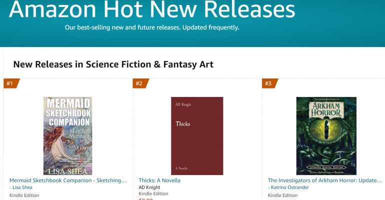
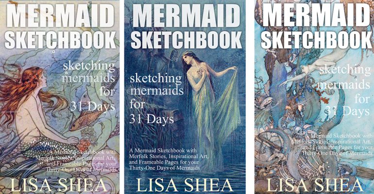
Amazon’s sub-sub-sub categories are getting out of control. There’s a category just for SciFi and Fantasy Art? Apparently I’m their top new release, with my mermaid book :).
On the downside, MOST of the other new releases in this area are massive amounts of AI-generated books featuring big-breasted fantasy porn and scifi porn. The books are flooding their system.
Here’s the link to my book, which is about the history and types of mermaids. It’s not a how-to-draw book.
Authors are often really good at writing, but less great at photography and illustration. What happens when an author is writing a book which could benefit from artwork?
Here are a few options for you.
Stock Photography
There are ALL sorts of stock photography sites out there. You can get free images, which is cost-effective, but which also means you can see the same image show up in 80 other books. You can instead pay a small amount for images, which means it’s much more likely your cover or illustration will be fairly unique out there. It’s key, especially with a cover, that your version stands out as unique. If 20 other books also have your exact same cover, it’s harder to be found.
ALWAYS always always keep track of exactly where you get each image and what the rights are to it. ALWAYS verify rights before using an image. You can get hit with fines of $25,000 or more for illegally using an image you do not have rights to.
Museum Stock Photos
Many museums give FREE rights of usage to images of items in their collection. This can be a powerful boost to anyone writing about historical topics.
There are many more out there as well. Always check to see how they want you to credit the image use.
Hand-done Illustrations
Talk to local art organizations to see if there are artists interested in working with you. This supports local artists and brings a fellow marketer on board as well! You can also look to build up your OWN talents to do your own artwork. A few art classes can go a long way!
AI / Artificial Intelligence Art
I strongly recommend AGAINST the AI-generated art option right now, because many AI companies are unethically / illegally using millions of “real” artists’ works in building their engines. There are many lawsuits moving through the courts to address this issue. To help clarify the issue, look at for example MidJourney:
This artwork is generated from prompts by AI. The AI is not “inventing” its art – the AI rather looks through the online web universe of existing artwork, created by humans, and then makes a version that mashes a few of those together. Many people are strongly against AI art for this reason. With all the challenges one has in launching a book, wading into the AI art debate is not an extra challenge you want to add onto your plate.
If you DO use AI art for any reason, make sure you clearly indicate this in your book. It’s important for ethical reasons.
At some point in the future there will be AI art generators which operate ethically based on opt-in artist submissions. At that point, there will be less of a negative aura around AI art for many people.
In early 2024, SmashWords decided it wanted to get out of the ebook publishing business. It let all of its authors know that their ebooks would be migrating over to Draft2Digital, to manage their publishing activities there. That migration did not go smoothly.
Let me explain what this is all about, what happened, and how to move forward.
SmashWords and Draft2Digital
When ebook publishing first began, there were only a handful of places one could publish their ebook. These sites included places like Lulu, Amazon, Barnes & Noble, and Apple. Over time, a number of other ebook library systems sprang into being. It became fairly onerous for an author to create an account on every single system, create an ebook entry on each one, maintain the updates with new versions, and so on.
This is where SmashWords and Draft2Digital came in.
Both SmashWords and Draft2Digital were ‘feed’ systems. You could load your ebook into SmashWords once. You simply clicked the checkboxes to indicate that you wanted SmashWords to distribute your ebook out to Apple, Barnes & Noble, Amazon, etc., and off the book went. You could load the book in one place and have it show up in a variety of different systems. This was a wonderful time saver.
The down side was that every system has its own categories, its own description length, and so on. So using an aggregator like SmashWords meant you were only shown the ‘lowest common denominator’ across all the sites. If Vendor X let you have an 800 word description and Vendor Y only had a 600 word description, you could only enter 600 words. That way your entry would work ‘everywhere’.
Because of this, I used the following process.
1) Amazon – I always loaded my book directly on Amazon first. Amazon provided 99.9% of sales, and I needed that to be absolutely perfect. Amazon gave access to far more options like categories, keywords, etc. than most other platforms. It was critical for my sales that my Amazon entry use every single option available and update instantly when I needed to make changes.
2) Draft2Digital – Draft2Digital was the aggregator which had the best other options. It supported Apple, Barnes & Noble, and other high-end competitors. I would NOT choose ‘Amazon’ from amongst the Draft2Digital options, since I had already direct-loaded my ebook onto Amazon. However, I did choose EVERY other option Draft2Digital supported, to maximize my reach.
3) SmashWords – For whatever reason, Draft2Digital did not reach every single publishing option out there. This is where SmashWords came in handy. SmashWords reached a lot of smaller options. So I would load my ebook into SmashWords and choose ‘everything else’. That is, I would select every option not already handled by Amazon or Draft2Digital.
This trifecta is how I have been maintaining my ebooks since 2013. I did this for about 60 of my 500+ books – all the free ones.
The SmashWords to Draft2Digital Migration
In 2024, when SmashWords decided they were going to move all of their publishing systems over onto the Draft2Digital platform, I was fine with it. As long as I didn’t lose access to existing partners, I could now manage everything just on Draft2Digital instead of having to log into both Draft2Digital and into SmashWords. I was given early access to this process since I have about 60 books in their systems. I went through the prompts to merge the libraries.
What they did instead was create two SEPARATE libraries, with different logons. And instead of using the existing links for what books where listed where, they created BRAND NEW listings for the books on systems where they were already listed.
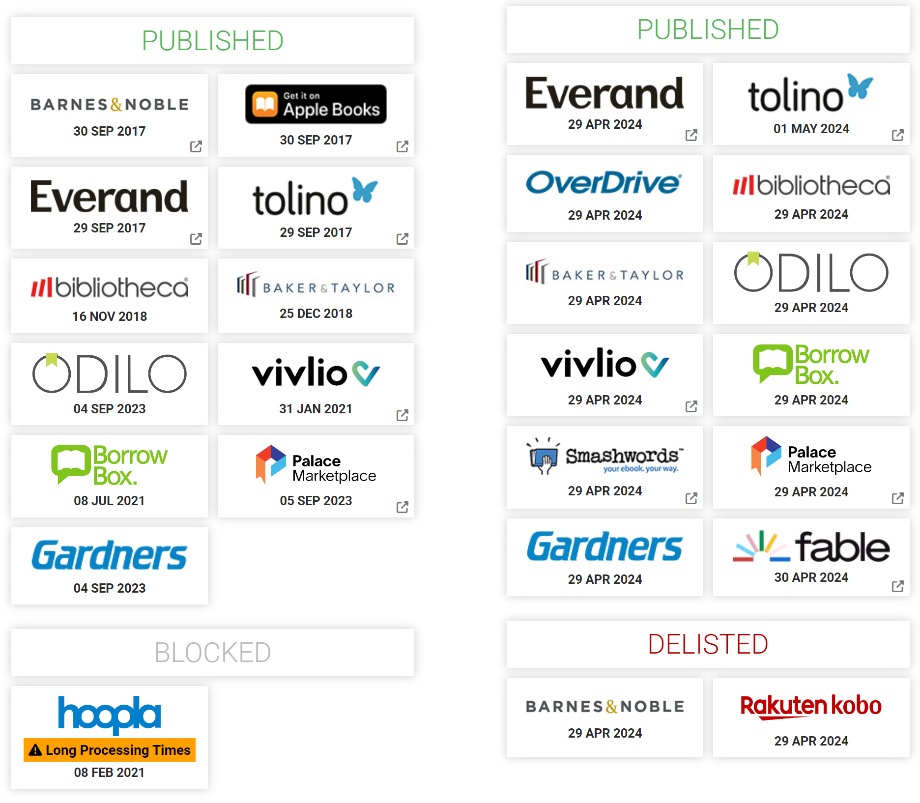
Let’s take a look at Knowing Yourself, my medieval romance which has been live since 2013. Left is when I began distributing it through Draft2Digital. Right is this new migration in from SmashWords.
Draft2Digital began fresh listing the exact same book Knowing Yourself on the exact same platforms as it was already on. There’s no way I would have had my SmashWords entry for Knowing Yourself to include Barnes & Noble, because that is always done by me through Draft2Digital. You can see on the chart that I’ve had Knowing Yourself on Barnes & Noble through Draft2Digital since 2017. There’s no reason for this new migration of the SmashWords version of it to try to put it onto Barnes & Noble again in 2024.
Right now, things are a mess. I have about 60 books which all just double-listed on a slew of platforms. I can’t just ‘delete’ entries because I can’t be sure which one they’re going to delete. I could have a book which was live since 2017 with hundreds of reviews and comments, and all of that could vanish.
It is frustrating that in 2024 we are still having these kinds of simple data issues. I was a database designer by trade for many years, so this is something I did for a living.
I will post updates as I work my way through this issue.
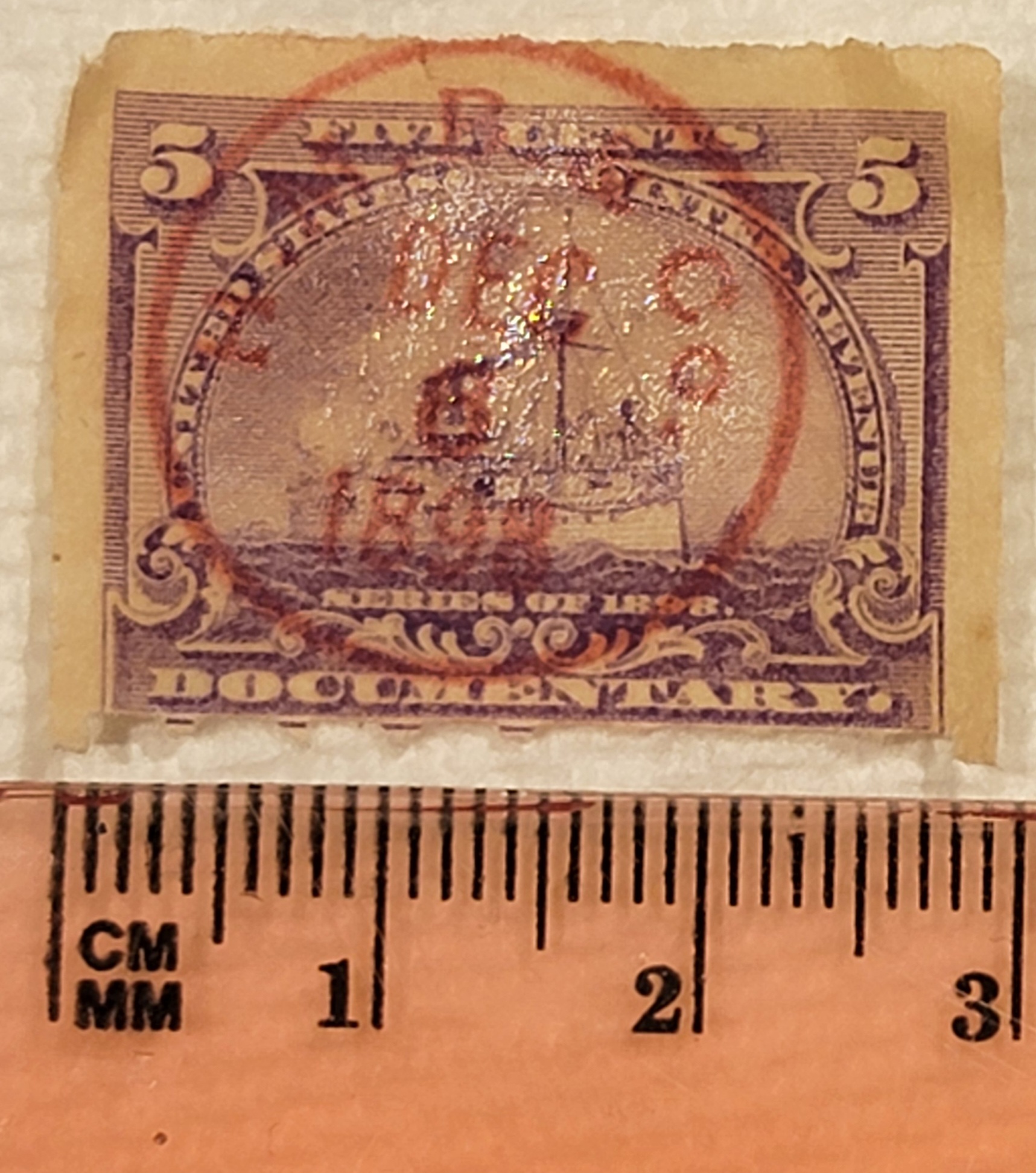
I love stamps. So did my father! My dad, George, was born in 1946. began collecting stamps when he was quite young. He would put ‘like stamps’ into little envelopes and have one representative stamp on the outside of the envelope. He’d often write little notes to himself on the back of the envelope. One envelope has his 1961 resolutions which include to ‘kiss a girl’. Just the thing I can see his fourteen-year-old self dreaming of!
The 5 cent documentary series of 1898 is not a “postage” stamp. This wasn’t put on an envelope to mail a letter to a friend. Instead, documentary stamps were used to signify something tax-related was paid for. So if you bought tobacco, for example, the stamp would show you paid the fee for it.
The stamp is in lilac / purple. It shows a battleship.
When I opened the little envelope for this stamp there were a few of the stamps stuck together. I gently soaked them in warm water for a few minutes until they separated. Then I tried them on a paper towel. I hope that was OK. Please let me know if you’d like to see any other photos or get any other information.
Prices on the web seem to range from $2.20 to $4.99 depending on quality, including shipping.
I have several of these, and I’ll start listing them in my ebay account.