

I often talk about how critical it is to optimize your book covers to shine in modern sales situations. Your covers must grab attention – in a sea of competitors – even at a small cellphone-browsing size. Otherwise the reader won’t even see the book to learn more about it.
Here are two recent examples.
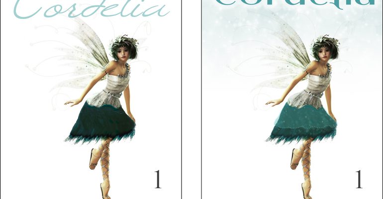
First, one of my own books. I’d designed this cover for my middle-school-aimed fairy tale short story. I loved the font and the feel of it.

However, the more I saw it at a small browser-on-phone size, the more I realized that title became illegible. Not only that, but many middle-school students are challenged by cursive letters. A title MUST be crystal-clear to its target audience. I was sad, but I updated my cover to this new version.

That is MUCH easier to decipher at a small browsing size. It’s also much more legible. It still has that ‘fantasy’ feel to it.
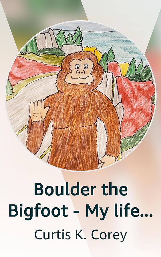
Here’s another recent example. My friend Curtis Corey was working on a mock-up for his latest children’s chapter book involving a friendly bigfoot character.

His personally-drawn cover image fits wonderfully with his hand-crafted theme. However, the title doesn’t stand out well against the blue background. Similarly, the lower white text has trouble being read against the background which ranges from dark to light. The bigfoot is almost ‘lost’ behind the words.
Here’s the update I made, to help this cover become more legible.

The letters now stand out more strongly against the background. The bigfoot character is much more visible. The title “BOULDER” and the word “BIGFOOT” are much more visible. The dark shadow behind the author name helps it stand out against both a lighter background and a darker background.
Just to further show the evolution, here was Curtis’s first version of the Boulder cover, when he had it on Kindle Vella.
In the original version, the colors were all muted and ‘middle value’ so the bigfoot character blended in too much with the background. You always want your main focal point to stand out against its background.
These kinds of tweaks can make an important difference in helping your book covers be seen and the reader taking a next step to learn more. A cover should never be ‘static’. It should be ever evolving and improving, optimizing toward drawing in the target audience for your book.
Ask with any questions!