

I love measuring things. I have devices around the house that measure humidity, temperature, carbon monoxide levels, VOCs, and particulates. With the global rise in pollution and pollen numbers, I’m particularly interested in tracking the particulate counts. I own the Amazon air monitor and was looking at the Dylos DC1100-Pro air quality monitor. I was intrigued – the Dylos doesn’t measure in industry-standard values of ug/m3. Instead it only measures in raw COUNTS of units, in an items-per-cubed-FOOT measurement. So how does that compare with the traditional ug/m3 value?
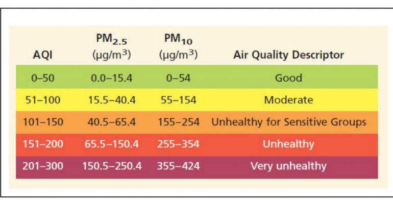
First, let’s talk about the industry standard for measuring pollution and pollen. That standard is ug/m3. Technically those letters actually look like this: μg/m3. You can see that in the chart below. Don’t worry about what the chart actually portrays – we’ll get into that soon enough.
In this essay, I’m generally not using the Greek letter μ or the superscripted 3 (m3) to make it easier for people to search on and find this write-up. People are generally going to search with the letter “u” rather than try to figure out how to make the Greek “micro” symbol μ.
What Is ug/m3?
In any case, the measurement part (the ug/m3) is indicating you count the pollen / pollution / etc. by taking a box of air that is a meter on each side – a cubic meter. This is roughly slightly larger than the size of a typical four-burner kitchen stove. Imagine that stove hollowed out and filled with air. That’s the air sample we’re talking about.
So now the pollution part. The ug part is micrograms. Micrograms is a weight value. It’s usually written either as ug or mcg. This is SMALLER than a milligram. A gram is very light – about the weight of one raisin. A milligram would be 1/1,000th of a raisin. A microgram would be 1/1,000,000th of a raisin. Very very small. So we are talking about quite teeny little volumes of pollution. If you look at that above chart from NASA, a combined weight of just 65 micrograms in an entire stove’s worth of air can cause damage to our lungs. That’s why it’s so important to be attentive to pollution and pollen.
What Is PM0.5 PM2.5 and PM10 for Pollution and Pollen?
Now that we know we’re measuring the weight of something in an air box the size of a stove, just what is it exactly that we’re measuring? Yes, we’re trying to measure pollution and pollen, but what do all these PM0.5, PM2.5, and PM10 numbers mean?
The numbers are categorizing the size of the pollution and pollen units. Larger units and smaller units damage us differently. Larger units might not wriggle into the lungs, while smaller units sneak into the lungs and cause damage there.
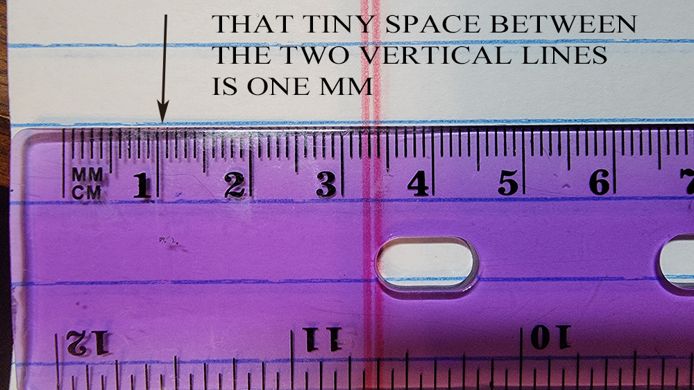
The PM stands for particulate matter. The number is about how many microns wide the item is. A micron is just a shorter name for a micrometer, which is abbreviated as u / μ. A micron is really tiny. If you look at a ruler, you know how it has centimeters (cm) and then tiny millimeters (mm)? You could fit 1,000 microns within one tiny millimeter.
This next diagram is from the EPA. It shows the relative size of items in the width of microns. Remember, you could fit 1,000 microns inside a single mm.
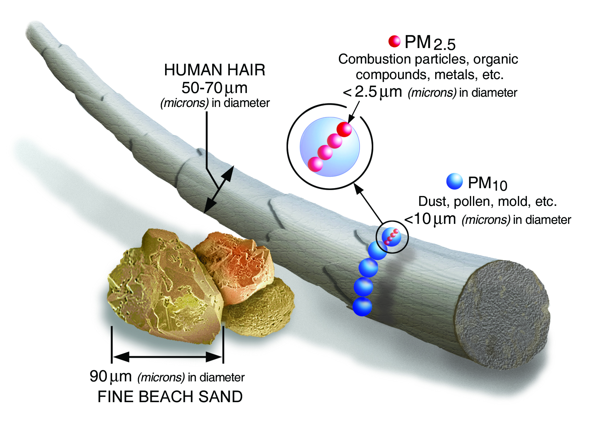
So if you know how thin a piece of human hair is, you can see how tiny something that is only 10 microns wide would be. Something only 2.5 microns wide is even teenier.
In terms of which types of pollution / pollen fall into which categories, here’s a lovely chart by Jisaac9, Mieszko the first:

So it’s good to know how MUCH pollution / pollen is in our air as a general weight per volume of air measurement. It’s also good to be able to break that out by how big or small the pollution / pollen items are, since each size has its own challenges.
So if we look at that EPA chart again, it’s starting to make more sense. It’s showing us the values for both ‘smaller’ (2.5ug) and ‘bigger’ (10ug) bits of pollution. It’s telling us how much weight of each could be found in a stove-sized cube of air before it starts to harm the human body.
The AQI is the Air Quality Index. It’s just a random range used to help the EPA give nice round numbers to reports, so they can tell weather stations “the air quality is 200 today – people should stay inside”. The AQI is not a measurement of anything specific. Similarly, the colors assigned to the ranges are just to help typical home viewers know that the air is healthy (green) or not healthy (red).
The numbers we actually care about measuring are the ug/m3 values for each group of particulates.
So how do you figure out what those values are for your own home or office?
Use a Weather App
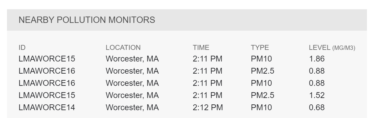
I like to use Weather Underground, but there are many web air quality reporting options out there. Weather Underground will give me a targeted value for both PM2.5 and PM10 on a regular basis. This gives me a starting point for how tree pollen, wildfire smoke, etc. are impacting my area. You’ll see in their reports that for Worcester they have at least three different stations (14, 15, 16) reporting.
But as we all know, pollution in one city can vary wildly between those who live next to a highway vs those who live on a high hill overlooking the ocean. So while a city-wide reading can give you a starting point, it’s also good to get a sense of how your actual personal space is doing. That’s where home monitors come in.
Amazon Home Air Monitor
There are many options on the market. For my testing I bought the Amazon air monitor. It ties into Alexa meaning I can check on it from anywhere I’m traveling, which is quite fun. I can tell exactly when Bob is cooking toast. Toast really lights up the system.
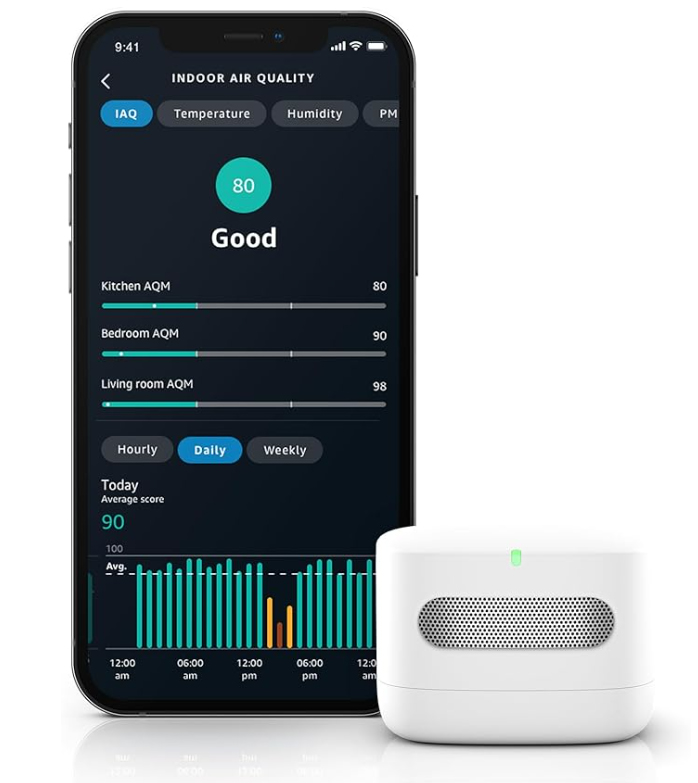
The air monitor itself really is that small, compared with a cellphone. I am in the process of doing an entire video series about using this, including doing petri-dish testing in areas, and more. so that is on its way. This article here is a starting point for that project. I’ll let you know when the video reviews are ready. As a super-quick summary, though, for particulates the Amazon unit is tracking the PM2.5 size and and can give updates every 5 minutes. You can move the monitor anywhere in the house as long as you can plug it in. It’s USB-powered so you can plug it into a power bank if you wish.

Dylos Air Quality Monitor
A relative of mine has the Dylos Air Quality Monitor. This is nice because it is able to measure SMALLER than PM2.5, which most home air quality monitors can’t do. The Dylos will show you a value for both PM0.5 and PM2.5. However, unlike most other air quality monitors, the Dylos only shows you a RAW PARTICLE COUNT, as in the actual number of little pollen or pollution items it counted. And the Dylos is counting those as an estimate for a 0.01 cubic foot of air. Yes, 0.01 cubic foot – a measurement value nobody else seems to use.
So how would you even convert that number into the industry standard ug/m3?
OK, let’s say you have a Dylos PM2.5 count of 1102. The system detected 1102 units of pollen (etc.) in a 0.01 cubic foot of air. According to the Dylos instruction manual, when it displays 1102 it would mean 110,200 units in a full cubic foot of air.
Now we need to convert what that would mean for a cubic meter of air. In order to convert from a cubic foot to a cubic meter, we multiply the cubic foot value by 35.3147. That would give us 3,891,680 individual pollen / pollution units in this cubic meter of air.
But what is that in the ug weight which is industry standard?
The average weight of a PM2.5 sized pollen / pollution item is 1.0×10⁻¹² kilograms = 0.000000000001 kg = 1 pg. That’s PICOgram. So if we take 1 picogram per pollen unit, multiply it by 3,891,680 pollen units in a square meter, we get 3,891,680 picograms of weight. That is equivalent to 3,891.68 nanograms of weight (1.0×10⁻⁹). That is equivalent to 3.89168 micrograms of weight (1.0×10⁻⁶). And micrograms per cubic meter is exactly what we were aiming to discover!
Going Forward …
So here’s what I’m still researching.
First, I’m assuming when the EPA has values for 2.5ug and then 10ug pollution groups, it’s not just catching items of that one particular exact size. I’m assuming the 2.5ug group actually means items in the range of 2.5ug to 9ug, and then the 10ug group is for items in the range of 10ug and up. But how far ‘up’ do they go? And do they really filter in a series, to make sure no larger-than-9ug items get into their smaller 2.5ug measuring unit?
The same questions would apply for the air monitors at home.
That information would then impact how we try to determine the “weight” per counted pollen unit, for counting devices like the Dylos. If Dylos reports let’s say 8000 pollen units of size 2.5ug, we imagine that not every single pollen unit is exactly 2.5ug in size. Some might be larger. Some may be 3ug. Some may be 4ug. So it would be useful to get a sense of what the average sized Dylos catch tends to be, in their 2.5ug filter section. Is there a way to tell?
I’ll post updates as I get more information! Let me know if you have any other ideas!
Pollution size chart by Jisaac9, Mieszko the first – This file was derived from: Airborne-particulate-size-chart.jpg:, CC BY-SA 3.0, https://commons.wikimedia.org/w/index.php?curid=86896879