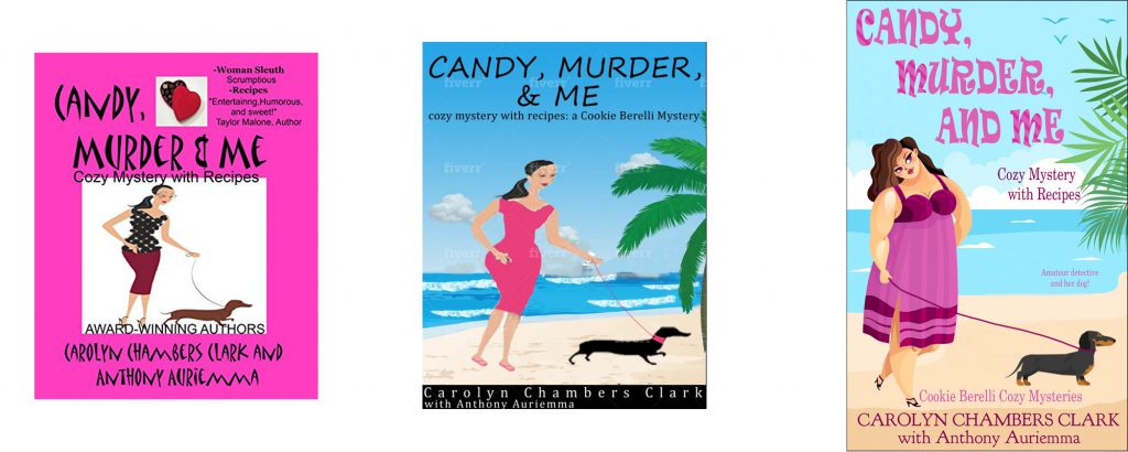
Please help me with a cover redesign! This is for a friend’s cozy mystery involving a plus-sized heroine, a dog, and recipes.
Do you prefer left, center, or right? Feel free to suggest font or layout changes.
The left was the original cover. The center was done by a Fiverr person. I did the right one myself to lend a hand.
Any and all suggestions welcome!


The one on the right is far superior to either of the others. The art works well. You might look at placement of the text for balance… (or if you’re in the mood, pay a visit to https://covercritics.com/ )